
Публикувано: Обновено:
————————–qgKFF2dUPvEKyx2Ex3WFzZ Content-Disposition: form-data; name=”file”; filename=”en10172.html” Content-Type: text/htmlMany business owners equate their brand with their logo. In practice, the logo is just one visual element of a significantly larger construct. A brand is the overall perception the audience builds through every interaction with your business – from colors and typography, through the tone of communication, to the emotion felt when visiting your website.
The data confirms how critical this perception is. 81% of consumers say they need to trust a brand before making a purchase. 94% recommend a brand they feel an emotional connection with. And 89% stay loyal to brands whose values match their own (data compiled from industry research by platforms like Statista). In other words, the brand is the foundation on which all marketing and sales efforts are built.
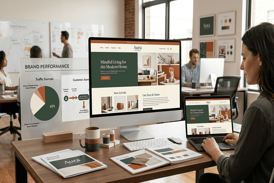
In the digital era, the most common “first meeting” with a brand is the website. Users form an opinion within 0.05 seconds, and 94% of these first impressions are tied to design. That’s exactly why a poorly designed site can destroy even a flawless brand strategy before it reaches the audience.
In this article, the CreateWeb team explains what a brand is, what branding is, what a brand book contains, and most importantly, how a website becomes the main digital projection of your brand. We’ll also introduce the Brand Projection System, a 4-layer framework describing how abstract brand strategy turns into a concrete website. We’ll finish with a practical checklist.
What a brand is – definition and evolution

At its core, a brand is the set of associations, emotions, and expectations that consumers connect with your business. The term derives from the Old Norse brandr (to burn, to mark), used by farmers to mark cattle. Today its meaning is incomparably more complex.
A modern brand consists of several dimensions. The functional dimension covers what you do and how you solve a problem. The emotional dimension describes what the customer feels when interacting with you. The visual dimension includes the logo, colors, typography, graphic elements – everything the eye registers. And finally, the verbal dimension, which covers the tone, voice, tagline, and the way you tell your story.
75% of users recognize a brand first by its logo, but 81% remember the brand’s color more easily than its name. That means the visual system works on a subconscious level, and it shows up most strongly through the website.
The Brand Projection System: from strategy to website
One of the most common mistakes in branding is treating the brand and the website as two separate projects – you develop a brand identity, then someone builds a site, and the two often don’t match. The reality is that the website is the digital projection of the brand, and the more accurate that projection, the stronger the trust. This framework, which we call the Brand Projection System, describes how abstract strategy turns into a concrete implementation across 4 layers.
| Layer | What it covers | Manifestation on the site |
|---|---|---|
| 1. Brand Foundation | Values, positioning, mission, voice | The tone of texts, messages |
| 2. Visual Identity | Logo, color palette, typography, style | UI components, hero, header/footer |
| 3. Brand Book | Rules, guidelines, design tokens | Consistency across all screens |
| 4. Web Projection | UI aligned with the brand, responsive, UX | An overall brand experience |
The principle of the system: every layer is projected into the next. Brand Foundation (Layer 1) determines the voice heard in the site’s texts. Visual Identity (Layer 2) is applied to the UI components. Brand Book (Layer 3) ensures the projection is consistent on every screen. Web Projection (Layer 4) brings everything together into one experience. A break between layers – for example, a beautiful site that doesn’t reflect the brand voice – destroys trust.
Applying the framework: you start from the foundation (what the brand is), document the visual identity, turn it into rules (a brand book or design tokens), and project it precisely into the site. The less “noise” there is between the layers, the stronger the brand is online.
Brand vs. logo vs. trademark – the clear boundaries

Confusion between these three terms is widespread, but the differences are substantial.
The logo is a graphic mark, a visual identifier. 60% of Fortune 500 companies use combination logos (symbol + text), and 40% use purely wordmark logos. The logo is an element of the brand, but it isn’t the entire brand.
The trademark is a legally protected mark – a logo, name, or phrase registered for commercial purposes. It protects against copying, but doesn’t generate trust by itself.
The brand is everything above and beyond these formal marks – it’s the feeling that remains with the customer after every touchpoint. 77% of consumers buy products by brand name, not by product name. This difference shows that the brand’s emotional construct is stronger than the specific item.
Layers 1 and 2 – brand elements: visual identity, voice, and values
An effective brand is built on three pillars, which need to work in sync.
Visual identity. Includes the logo and its variations, a color palette (primary and secondary colors), a typographic system (heading and body fonts), graphic elements (icons, illustrations, photographic style), and layout rules. Color increases recognition by up to 80%, and using a signature color can triple brand memorability. 85% of buyers name color as a primary reason for buying a product. 93% of consumers say visual appearance is the deciding factor in a purchase.
Brand Voice. The tone, language, style – whether it’s formal or conversational, expert or accessible. 88% of consumers emphasize the importance of authenticity in brand communication. A consistent brand voice contributes to 10-20% revenue growth at 68% of companies.
Values and positioning. 89% of consumers stay loyal to brands whose values they share. 53% expect brands to take a stance on at least one social issue. B2C consumers are 4-6 times more likely to buy from brands with a clear mission.
These three pillars find their most direct digital embodiment in the website – the only space you control 100%, unlike social media and marketplaces. The approach to web design turns these elements into a visible, functional system.
Layer 3 – what a brand book is, and when you need one
A brand book (brand guidelines) is the document that turns abstract brand strategy into concrete, actionable rules. 95% of companies have some form of brand guidelines, but only 25% apply them consistently, and that exact difference separates strong brands from mediocre ones.
A full brand book typically contains: the brand’s history and mission, values and tone of communication, the logo (primary, monochrome, negative, minimum size, and clear space), a color palette with exact values (HEX, RGB, CMYK, Pantone), a typographic system (heading and body fonts, hierarchy H1-H6, body, caption), an iconographic style and illustrative approach, a photographic style (tone, lighting, processing), examples of correct and incorrect usage, and a tone-of-communication guide with sample phrases for different channels.
For small and medium businesses, a full brand book can seem unattainable. That’s why the Minimum Viable Brand Book is a practical alternative. It includes a logo with 2-3 variations, a color palette (3-5 colors with HEX/RGB), 1-2 fonts with a defined hierarchy, and a short text guide for the tone of communication. Even this minimal framework drastically improves consistency once it’s time to build a website.
Layer 4 – the website as the main digital projection of the brand

This is why the website isn’t “just an online business card,” but the most critical brand asset in the digital space.
The first impression is visual and instant. Users form an opinion of a website within 0.05 seconds. 94% of these first impressions depend on design – not on the text, not on the offer, not on the price. 92% of people consider well-designed sites more trustworthy, and 94% are more likely to stay on a site with an attractive layout. The reverse is just as uncompromising: 38% of users leave a site with unattractive design, and 57% won’t recommend a brand with a poorly designed mobile site.
The website is “owned territory.” Unlike Facebook, Instagram, or Google, the site is yours – you control the visuals, speed, UX, and messaging. Social platforms can change algorithms, restrict organic reach, or even shut down your account. The website remains.
Every digital channel “flows” toward the site. As we covered in the article on digital marketing, the website is the hub: SEO, PPC, social media, email marketing – all channels direct traffic there. If the site’s visuals don’t match the brand, conversions collapse. 90% of consumers expect a seamless brand experience across all channels.
Design is UX, and UX is trust. 48% of consumers say design is the leading factor in deciding whether to trust a business. 71% of companies with clear brand guidelines confirm that visual standards improve the user experience, including navigation, session time, and conversions. The principles of UI and UX design are directly tied to how a brand builds trust.
How CreateWeb turns a brand book into a working site
Our team’s design process is structured so brand identity is built into every pixel of the final product. The work goes through four phases.
First, consultation and analysis. The team gets acquainted with your brand book (if you have one), the competitive landscape, target audience, and business goals.
The second phase is wireframing, information architecture, and the page skeleton. This is where the content hierarchy, CTA button placement, navigation structure, and mobile-first layout are defined. A proper wireframe ensures the brand message is clear already at the structural level.
The third phase is visual design. This is where the brand book comes to life: the color palette is applied to UI components (buttons, header, footer, cards), the typographic hierarchy defines H1-body in line with the brand guidelines, icons and illustrations follow the established graphic style, and photos are chosen or processed to match the brand tone. Every element is responsive, and the visuals stay consistent on desktop, tablet, and mobile devices, since 65% of users leave a site that isn’t mobile-friendly.
The fourth phase is approval and implementation. The design is finalized with up to 3 iterations, after which the files are prepared for development. The end result is a site that doesn’t just “look good,” but systematically projects a brand experience, from a landing page to a corporate site or an e-commerce platform.
Color psychology and typography: the invisible engines of brand trust
Color and font are two elements users rarely consciously notice, but which form up to 90% of subconscious product decisions.
Color. Blue is the most trusted color in branding, which is why it dominates in finance, healthcare, and technology. Green signals wellness and sustainability. Black, luxury and premium. Red, energy and urgency. What matters: the color choice should come from brand strategy, not personal preference. 85% of buyers say color makes a brand more recognizable and influences the purchase. In 2026, the trend is toward saturated, “dopamine-driven” palettes and duotone combinations, but the fundamental principle remains unchanged: consistency matters more than trend.
Typography. A font communicates character before the user reads a single word. Serif fonts (like Georgia or Times) create a sense of tradition and authority. Sans-serif (like Inter or Helvetica), modernity and cleanliness. In 2026, kinetic typography (animated fonts) is gaining traction in web design, but at a basic level, the system should include a maximum of 2 font families with a clear hierarchy. The scientific principles behind these choices are well documented by the Nielsen Norman Group, a leading authority in UX research.
When we design your site, colors and typography are defined as CSS design tokens, which ensures that every screen and component – from the hero section to the contact form – follows the brand palette with no deviation. This is the practical application of Layer 3 of the Brand Projection System.
Branding mistakes that kill trust online
Dozens of companies invest in brand strategy, but then neutralize it with technical and design gaps on the site.
Visual inconsistency across channels is the first mistake. The logo is one color on Facebook, another on the site, and a third on the business card. 90% of consumers expect brand consistency; without it, 71% of businesses confirm that customers get confused.
A slow or technically compromised site is the second. 53% of mobile users leave a site that takes more than 3 seconds to load. Even a flawless brand is useless if the user can’t see the site. The technical foundation – hosting, optimization, and maintenance – is the invisible part of the brand experience.
Stock visual content instead of custom is the third. Personalized visuals outperform stock ones in engagement 7 times over. When a user recognizes a generic photo, brand trust drops instantly.
Lack of mobile optimization is the fourth. 57% of consumers refuse to recommend a brand with a poorly designed mobile site, and 63% of them in 2026 say that after one negative mobile visual encounter, they stop following the brand entirely. With over 60% mobile traffic, that’s a catastrophe.
An abandoned or outdated site is the fifth. A site that hasn’t been updated in years communicates a lack of care, and 60% of consumers avoid brands with an unprofessional-looking logo and visuals, even if the product is better than the competition’s. Sometimes the solution is a complete site redesign.
Branding trends in 2026: AI, authenticity, and interactive experiences
The branding landscape is changing at an accelerated pace, and 2026 outlines three leading directions.
AI-generated design systems. AI tools are already helping create brand elements, from color palettes to logo variations. 43% of mid-sized companies already use AI-assisted illustrations. Still, brand strategy remains human work – AI speeds up execution, but can’t replace the emotional intelligence behind positioning.
Hyper-personalization. 75% of consumers prefer brands that personalize the experience. In a web context, this means dynamic content, adapted hero text, personalized recommendations – elements that require a technical foundation, UX design, and conversion optimization.
Motion-first branding. Animated logos, kinetic typography, and micro-interactions are becoming standard brand elements. Motion logo variants are 2.6 times more memorable than static ones among audiences under 35. The website is the primary platform for these experiences.
What all three trends have in common is that each requires a professionally designed and technically stable website as a foundation. Branding in 2026 lives online, and the site is its home.
Checklist: is your site brand-ready?
Before investing in advertising, SEO, or social media, answer the following questions.
Logo – is it on the site in the correct format, with sufficient clear space, in variations for light and dark backgrounds?
Color palette – are the precisely defined brand colors (HEX/RGB) used everywhere, or are there random deviations?
Typography – does the font hierarchy (H1-body) follow the brand book, or are different fonts mixed together?
Responsive consistency – is the visual identity preserved on mobile devices, or do elements “break” and lose brand identity?
Tone of communication – do the texts, buttons, forms, and microcopy reflect the brand voice?
Speed – does the site load under 2.5 seconds (LCP), so it doesn’t ruin the brand experience with waiting? This is tied to Core Web Vitals.
OG image and meta – is the correct brand image shown when shared on social media?
Visuals – are you using custom illustrations/photos, or generic stock ones?
If you answer “no” or “not sure” to more than two questions, it’s worth getting a professional website analysis and reconsidering the design.
Frequently asked questions
What’s the difference between a brand, a logo, and a trademark?
The logo is a graphic mark, a visual identifier. The trademark is a legally protected mark, registered for commercial purposes. The brand is everything above them – the overall perception, emotions, and expectations the customer connects with the business after every touchpoint. The logo is an element of the brand, but not the whole brand. 77% of consumers buy by brand name, not by product name.
What is the Brand Projection System?
It’s a 4-layer framework for how a brand is projected into a website: Layer 1 Brand Foundation (values, positioning, voice), Layer 2 Visual Identity (logo, colors, typography), Layer 3 Brand Book (rules, design tokens), and Layer 4 Web Projection (UI aligned with the brand, responsive, UX). The principle: every layer is projected into the next, and the less “noise” there is between them, the stronger the brand is online.
What is a brand book, and do I need one?
A brand book is a document that turns brand strategy into concrete rules – logo variations, color palette, typography, tone of communication. 95% of companies have some form of one, but only 25% apply it consistently. For a small business, a minimum viable brand book (a logo with 2-3 variations, 3-5 colors, 1-2 fonts, a text guide) is a sufficient starting point.
Why is the website so important for the brand?
Because it’s the most common “first meeting” with the brand and the only space you control 100%. Users form an opinion within 0.05 seconds, and 94% of these impressions depend on design. Every marketing channel (SEO, ads, social media) directs traffic to the site – if its visuals don’t match the brand, conversions collapse.
Which colors build the strongest trust in branding?
Blue is the most trusted color, which is why it dominates in finance, healthcare, and technology. Green signals wellness and sustainability, black, luxury, red, energy and urgency. What matters is that the choice comes from brand strategy, not personal preference. 85% of buyers say color influences the purchase.
How many iterations does designing a brand-aligned site take?
In our process, the visual design is finalized with up to 3 iterations, after consultation and brand analysis, wireframing, and applying the visual identity. The goal is a site that systematically projects a brand experience on every screen, not just one that looks good.
How does CreateWeb ensure brand consistency on the site?
We define colors and typography as CSS design tokens, which ensures every screen and component – from the hero section to the contact form – follows the brand palette with no deviation. The brand book (if you have one) is built into every phase, from wireframe to responsive implementation across all devices.
Conclusion: the brand lives on your site
A brand isn’t a static logo on a business card. It’s a living organism, expressed at every digital interaction, and the website is its main stage. When 94% of first impressions depend on design and consistent branding increases revenue by up to 33%, investing in a site that genuinely projects the brand isn’t an expense – it’s a strategic asset.
The Brand Projection System from this article gives a clear structure: Layer 1 Brand Foundation (strategy and voice), Layer 2 Visual Identity (logo, colors, typography), Layer 3 Brand Book (rules and design tokens), and Layer 4 Web Projection (the projection onto the site). The principle: every layer is projected into the next, and the more accurate the projection, the stronger the trust.
Whether you’re starting from scratch or have a brand book waiting to come alive online, our team builds websites that don’t just “look good,” but systematically communicate your brand on every screen and at every touchpoint.
Ready? Get in touch with us for a free consultation, or take a look at our portfolio.
For related specialized resources: digital marketing, what web design is, UI and UX design, minimalist web design, website redesign, SEO web design, Core Web Vitals, conversion rate optimization, website analysis tools, quality web hosting, website development, website maintenance.
————————–qgKFF2dUPvEKyx2Ex3WFzZ–